
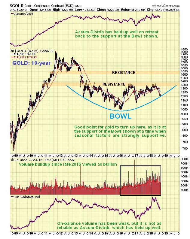
Taking all of the above into account it is thus very interesting to observe gold’s latest 10-year chart on which we see that its price has dropped down to arrive at the support of a giant Bowl pattern, so, again, this is a very point for it to turn up. The pattern in gold since early – mid 2013 may also be described as a complex Head-and-Shoulders bottom which is not shown here as it would make the chart rather messy, and the Bowl pattern suffices to define what is going on, at least for now.
 t.
t.
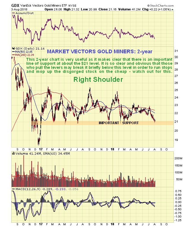
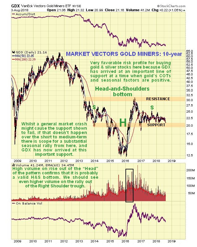
The 10-year chart for GDX continues to show it seemingly working on completing the Right Shoulder of a giant Head-and-Shoulders bottom. If this is what it is then we are clearly at a very good entry point for many stocks now.
 https://www.clivemaund.com/gmu.php?art_id=68&date=2018-08-06