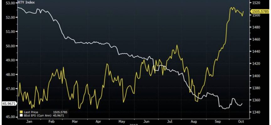
As central banks pretend stocks will stay elevated without the cocaine of additional QE, here is the WTF? chart of 2017.
Mania In Full Swing
By Peter Boockvar, author of the Boock Report
October 20 (King World News) – Here is what Peter Boockvar wrote as the world awaits the next round of monetary madness: Here is a chart of the Russell 2000 since the beginning of 2017 in yellow with earnings estimates for the components (see chart below).
WTF? Earnings estimates tumbling (white), while stocks soar (yellow)

